



Most entrepreneurs think seriously about identity only once the business is already in visual chaos. The website uses one style, social media another, the sales proposal looks as if it came from a third company, the partner deck uses a random template and campaign material shares little beyond the logo.
At first, that can feel harmless. Customers still arrive, products still sell and the team keeps moving. As the business grows, however, inconsistency becomes more than a visual issue. It slows content production, complicates work with partners, weakens recognition and gradually erodes trust.
That is when a business needs more than a beautiful logo. It needs a complete visual system.
Brand guidelines and identity are often seen as expensive, complicated and relevant only to international companies. In reality, a strong identity matters most when a business is growing, entering new markets, advertising, hiring, launching products or working regularly with external specialists.
Because identity answers an important question: how should a company look and feel at any point of contact with a customer?
Identity, brand and brand guidelines: what is the difference?
These terms are often confused, although they denote different levels of work with a company.
A brand is the overall perception of a business. It is not merely a name, logo or colour, but the associations, expectations and emotions the company creates. Product quality, service, communication, reputation and visual presentation all shape it.
Identity is the brand’s visual language. It includes the logo, colours, typography, graphic elements, photography, interfaces, advertising, packaging, social media and other touchpoints. A good identity makes a company recognisable even when the logo is absent.
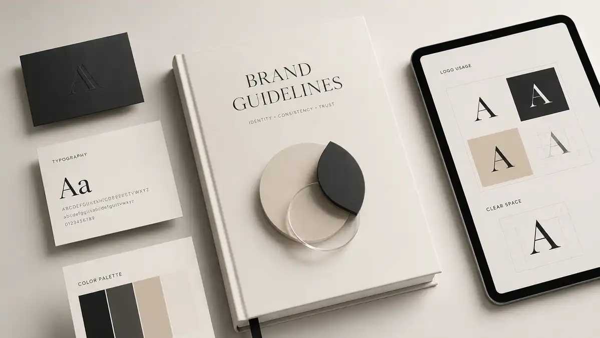
Brand guidelines define how that system should be used. They show employees, designers, marketers, developers and partners what belongs to the brand, which decisions are acceptable and which would dilute it.
Guidelines do not need to run to two hundred pages. Their scope should match the business. A small company may need a compact set of core rules; an international brand may need detailed documentation across dozens of formats, markets and teams.
The value of brand guidelines is not measured in pages. It lies in helping teams reproduce the brand consistently without the owner policing every detail.
Why one logo is not enough
A logo is only one element of a visual system. It cannot solve all communication problems by itself.
Imagine a company receives a beautiful logo and several variants. A month later it needs a presentation. Then an advertising campaign, social templates, packaging, an exhibition banner, a website update and a sales proposal.
If, apart from the logo, the business has no rules, each new material is created from scratch. One designer chooses a dark background, the other uses white. One adds bright gradients, the other works in a strict corporate style. One uses modern typography, the other chooses the first available font.
Formally, the logo remains the same everywhere. But the brand looks different every time.
Customers may not articulate the problem, but they notice that the system is missing. The company feels less mature, less organised and less reliable. That matters especially in premium services, B2B, technology, finance, property, manufacturing and healthcare, where trust directly affects the buying decision.
Identity creates the visual logic that makes every asset feel part of the same company. It carries the brand’s character across formats while protecting recognition and the intended impression.
A strong identity does more than make a business look good
The common mistake is to judge identity on aesthetics alone: beautiful or ugly.
That's not enough for business.
A good identity has a job to do. It helps the company stand apart, become memorable, reinforce its positioning and reduce random decisions whenever new material is created.
It also affects the perceived value of the product. The same product or service can be perceived quite differently depending on how it is packaged and presented.
This does not mean that expensive design can save a weak product. But a strong product without quality packaging often looks cheaper, simpler, and less reliable than it actually is.
The company then has to explain its value for longer, compete on price more often and work harder to earn trust.
A strong identity narrows this gap. It helps the external image of the business to match the real level of the product, team and service.
How the visual system affects trust
People rarely judge a business by one element. They build an impression from many signals: website, logo, photography, copy, reviews, social profiles, documents, advertising, packaging and conversations with the team.
When these signals are coordinated, the business is perceived as a single system. When they contradict each other, doubt arises.
A company may claim a premium service while using an outdated logo, random photography and a weak sales proposal. It may talk about technology while its website looks a decade old, or promise attention to detail while changing colours, fonts and tone from one channel to the next.
Each such inconsistency reduces the credibility of the positioning.
The customer may never explain the doubt. They simply keep comparing and choose a competitor that looks more coherent and professional.
Identity therefore affects more than recognition; it can affect conversion. It visually confirms the promises a business makes in words.
What should be part of a normal identity
The scope of an identity depends on the business. No single package suits a restaurant, manufacturer, technology start-up and online store equally well.
However, a complete system usually includes several key levels.
The first level is the brand foundation: positioning, character, audience, values, competitive difference and desired perception. Without it, visual decisions follow personal taste rather than business objectives.
The second is the core visual system: logo versions, clear space, placement rules, brand palette, typefaces, composition principles and graphic elements.
The third governs visual content: photography, illustration, 3D, icons, diagrams, data visualisation, video and motion. It is especially important for companies that publish frequently or run campaigns.
The fourth covers real-world touchpoints: websites, social media, presentations, proposals, business cards, documents, outdoor advertising, packaging, uniforms, offices and retail spaces.
UI components matter for digital businesses too. Buttons, forms, cards, imagery, interface states, icons and animation should support the brand rather than sit outside it.
An identity is not a folder of separate visuals. It is a system that connects strategy and design across real customer touchpoints.
Why a brand book is especially important when working with contractors
As long as all materials are handled by one person, the visual style can be preserved by personal experience and memory. But once a business starts working with multiple professionals, the system quickly breaks down.
One team develops the website, another runs social media, a freelancer makes campaign banners, a manager assembles presentations, a printer prepares physical material and a production company creates video.
Each partner sees only one part of the picture. Without shared rules, every person is forced to interpret the brand independently.
As a result, a business receives not one identity, but several parallel versions of itself.
Brand guidelines reduce dependence on subjective decisions. Instead of asking someone to “make it beautiful and in our style”, you can provide a concrete system: colours, logo use, suitable imagery, typography, composition and elements that are off limits.
This speeds up approvals, reduces revisions and produces more consistent work.
Identity becomes especially important during scaling
At the start, many decisions are made manually. The business owner personally coordinates each banner, checks publications, selects photos and explains to contractors what the company should look like.
This model stops working when you grow.
As the team, product range, channel mix and number of markets grow, controlling every asset becomes impossible. The company may create tens or hundreds of pieces each month, with new managers, marketers, designers, partners and local teams involved.
Without a system, quality inevitably begins to decline.
Brand guidelines turn knowledge that once lived only in the founder’s or lead designer’s head into a practical standard. That allows communication to scale without losing character.
This is especially important for companies entering the international market. Language, content and advertising may change across countries, but the brand must remain recognizable and consistent.
A good identity allows flexibility. It doesn’t make all materials look the same, but it sets a framework within which a brand can adapt to different tasks and formats.
Positioning is more important than personal taste
One of the most difficult parts of creating an identity is to separate the business task from the owner’s personal preferences.
An entrepreneur may like a certain color, style, or font. But the visual system is not designed to reflect only the taste of the owner. It should be clear to the target audience, match the product, support the price segment and distinguish the company from competitors.
For example, an overly aggressive identity may not suit a legal or medical company, even if it is visually spectacular. An overly neutral corporate style can make a young tech company invisible. Too trendy design can quickly become outdated, and an overly conservative image will prevent a brand from looking modern.
Therefore, the process of creating an identity should begin with business analysis.
You need to understand who the company sells to, which problem it solves, why customers should choose it, what associations it should create and where people will encounter the brand.
Only then can decisions be made about color, shape, typography and visual language.
Why copying competitors does not create a strong brand
When developing an identity, businesses often focus on market leaders. This is useful for understanding industry standards, but becomes a problem when analysis turns into copying.
If all construction companies use the same silhouettes of buildings, all technology startups choose blue gradients, and all financial services are designed in the same minimalist style, the market becomes visually homogeneous.
A company may look professional and still have no distinctive character.
A strong identity should take into account the visual context of a niche, but not dissolve in it. Sometimes it is enough to change the nature of typography, composition, image work or graphic principle to make the brand recognizable without artificial extravagance.
Distinctive does not have to mean loud. A premium minimalist brand can have a powerful personality when its system is consistent and precise.
How to know if your current identity is no longer working
The need for a brand update isn’t always due to the fact that the logo looks old. Sometimes the problem is deeper.
The company may have grown while its visual image still resembles a small local firm. New services may no longer fit the old system. The brand may have moved upmarket while its presentation still makes the offer feel cheap.
Another signal is that every new asset starts almost from scratch. If designers repeatedly ask the same questions, employees use different logo versions and the social channels do not feel connected to the website, there is no working system.
A further sign is reluctance to share company materials. A manager hesitates to send a deck to a major partner, the website undersells the business and the proposal needs a verbal explanation because it fails to communicate the value.
In such cases, the renewal of the identity is not a cosmetic repair, but part of a new stage in the development of the company.
Rebranding does not always mean replacing everything
Some companies put off working on identity because they fear losing recognition. But brand renewal does not necessarily require a complete abandonment of existing elements.
Sometimes an evolutionary rebrand is enough: retain the recognisable core of the logo while improving its proportions, typography, palette and usage rules. The visual language can evolve without changing the name or key symbol. If the existing logo still fits the positioning, a complete system can be built around it.
In other cases, the old identity does limit development. For example, it may be too tied to a single product, a local market, or an outdated business model. Then the company needs a deeper processing.
The decision should follow an analysis of what works, what gets in the way and what the brand must achieve over the next few years, not whichever style is currently fashionable.
A good brand should help, not limit
Rules that are too rigid can make an identity frustrating to use. If the guidelines allow only a handful of fixed layouts, the system quickly breaks down when new formats appear.
A modern brand lives across websites, mobile interfaces, social media, video, presentations, advertising, physical media and internal documents. No guideline can predict every future layout.
Good brand guidelines define principles as well as templates. They explain how to make decisions in the brand’s voice and visual language.
What should the composition be? How tight or loose can the layout be? What is the nature of the images? How to use accent colors? What does the typographic hierarchy look like? What emotions should content create? How does the brand move and sound in the video?
When rules are built on principles, the designer can create new solutions while maintaining the character of the company. The brand remains alive and growing with the business.
What business gets from a strong identity in practice
The result of the work on identity is manifested not only in the updated logo.
The company creates new material faster because the fundamental decisions are already made. Marketers do not choose colours and fonts from scratch. Designers have direction. Developers understand the interface language. Video teams know which graphics and motion belong to the brand.
Revisions and approval rounds decrease. New employees learn the visual language faster. Channels reinforce one another, and customers can connect different assets to the same organisation more easily.
A strong identity also creates the foundation for marketing. Advertising brings someone to the website, the website continues the same story, the proposal supports the promise and social media maintains the impression.
When each channel speaks its own visual language, some of the marketing effect is lost. When the system works consistently, each new touch strengthens the brand.
When does a business actually need brand guidelines?
Comprehensive brand guidelines are especially useful when a company regularly creates campaign material, works with several partners, develops social channels, launches products, opens locations, enters new markets or builds an internal marketing team.
They also matter when a business is repositioning, moving upmarket or ready to stop looking smaller than it really is.
Not every company needs the complexity of an international brand from day one. The scope should match the work the system needs to support.
For a small business, concise guidelines covering positioning, logo use, colour palette, typography, imagery and core templates may be enough. The system can expand as the business grows.
The important point is that the identity is not produced for show; it must be used in day-to-day work.
Identity as brand infrastructure
A strong identity is not decoration added after the business is built. It is part of the infrastructure.
It connects strategy, marketing, design, digital products, communication and customer experience. The company remains consistent regardless of who creates the next asset.
That is why identity often proves its value months and years after the logo launch. It keeps saving time, simplifying work, strengthening recognition and protecting quality as the brand grows.
A good brand book does not replace a strong product, service or marketing. But it helps to show their value clearly, convincingly and consistently.
For an entrepreneur, this means less visual chaos, less reliance on individual contractors, and more control over how the market perceives the company.
For customers, it creates a clear, recognisable and professional business that is easier to trust.
Pump Agency: Creating an identity as a working system
At Pump Agency, we do not treat identity as a standalone logo or a set of attractive layouts. We connect it to positioning, website, marketing, content, advertising, presentations and the company’s next stage of growth.
We create systems that employees, designers, developers, marketers and external partners can actually use. If your visual image no longer reflects the level of the business, the material feels inconsistent and every new partner interprets the brand differently, another isolated banner redesign will not solve it. You may need an identity built to grow with the company.
Discuss visual identity